 11
In an era dominated by hyper-accelerated social media micro-trends and fleeting design fads, major color authorities are beginning to push back in favor of longevity. Making interior design choices based purely on the moment can often feel like a high-stakes gamble, even when applied to something as technically straightforward to change as a coat of paint. As the color trend forecasting team at Benjamin Moore gathered to pinpoint the defining shade for the upcoming year 2027, their primary objective was to deliberately steer clear of anything ephemeral that would fail to stand the test of time.
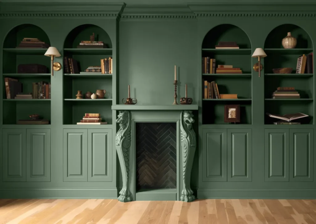
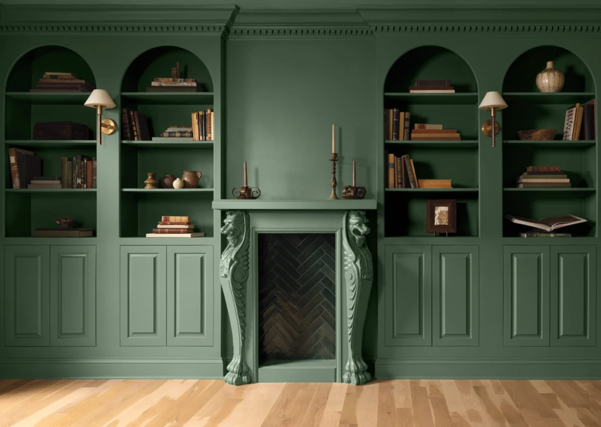
Instead of chasing viral aesthetics or hyper-modern novelties, the expert team selected a sophisticated hue that subtly nods to the cultural urge to step away from the mind-numbingly rapid online trend cycle and seek genuine grounding. Benjamin Moore has officially announced that its Color of the Year for 2027 is Webster Green. Drawn directly from the brand’s esteemed Historical Collection, Webster Green is a verdant, mid-tone green distinguished by its cozy and comforting blue-gray undertones, giving it a rich heritage and a reassuring sense of place.

According to brand leadership, the selection captures both a forward-looking design philosophy and the company’s historical perspective on interior color. Andrea Magno, vice president of brand, color, and integrated marketing at Benjamin Moore, notes that the chosen shade successfully bridges historical tradition with distinct personal character. The color carries a certain timeless quality, she points out, while effortlessly maintaining a fresh and relevant feeling for contemporary living spaces.
The decision to crown Webster Green as the premier color for 2027 emerged organically from an intensive research initiative undertaken by Benjamin Moore’s color studio. The overarching finding from their extensive consumer research was clear: modern homeowners are actively looking to transcend quick trends in favor of lasting style and emotional sanctuary. As consumers plan home renovations and interior updates, they are increasingly drawing inspiration from the past to shape their immediate surroundings, aiming to transform their living quarters into protective, enduring cocoons against an increasingly chaotic world.

Webster Green does not stand alone; it anchors the broader Color Trends 2027 Palette, which includes seven other complementary shades designed to evoke a profound sense of calm and familiarity. This curated palette ranges from earthy neutrals like Shakespeare Tan and Antique Copper to the soft lilac of Wild Aster and the deep olive warmth of Durango. Rounding out the eight-shade collection are Townsend Harbour Brown, White Down, and Nelson Blue, each carrying a quiet familiarity that appeals to consumers seeking stability in their domestic environments.
The psychological pull of these colors is directly tied to the relentless pace of contemporary life. Magno emphasizes that the fast-paced nature of the modern world drives a powerful consumer need for emotional stability and compositional balance. Webster Green possesses a distinctive pedigree that makes it feel entirely appropriate for today’s homes, perfectly encapsulating the ethos of the entire 2027 collection: relevant for the present moment while firmly rooted in timeless design principles.

Prominent interior designers have already begun weighing in on the versatility and visual weight of the palette. Todd Nickey and Amy Kehoe, the creative minds behind the acclaimed AD100 design firm Nickey Kehoe, find themselves closely aligned with Benjamin Moore’s vision. Nickey describes Webster Green as a quiet yet inherently dramatic green, noting that it possesses a reassuring visual quality that makes a room feel immediately grounded and reliable.
When considering how to incorporate these nuanced shades into real-world residential projects, design professionals look to architectural layout and lighting to maximize impact. Kehoe explains that if their firm were designing a project utilizing the 2027 palette, they would likely anchor the space by applying darker, more saturated shades on the walls—such as Durango or Webster Green—while pairing them with a lighter, more reflective ceiling treatment like Nelson Blue.

Alternatively, Kehoe suggests that a shade like Shakespeare Tan could work exceptionally well for architectural elements such as door casings and ceilings when paired with Webster Green on the surrounding walls. According to Kehoe, the inherent richness of this carefully selected color palette is uniquely suited for creating enveloping spaces that warmly embrace everyone who enters the room, reinforcing the home’s role as an enduring sanctuary.